
| Scatter Plot Window | |
The Scatter Plot window allows you to plot one data column versus another. Choose the data column to plot on the y-axis from the Plot drop-down box, and the data column to plot on the x-axis from the versus drop-down box. Windographer will draw a small mark for every data point for all time steps that contain valid data in both data columns, and that satisfy any filter conditions that you impose.
Tip: You can apply flags directly to a scatter plot using the Flag By Scatter Plot window. For details, please see the article on flagging data.
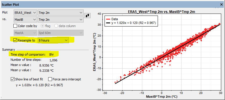
The x-axis and y-axis data columns can come from the same dataset or from different datasets. If they come from different datasets with different time contexts Windographer will automatically resample the data column with the shorter time step so that its time steps align with the other.
Use the checkbox labeled Resample to if you want to resample to a time step other than the one Windographer has automatically chosen. The time step of comparison appears in the summary outputs:
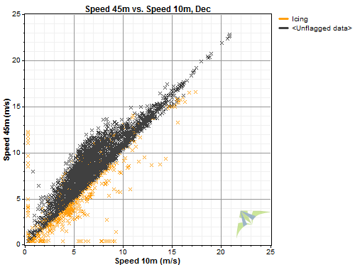
If you have applied flags to the dataset and you want the scatter plot to reflect the flag status of each data point, check the Color code by flag checkbox. In the graph below for example, the orange points appear orange because either their x or y values have been flagged with the 'Icing' flag, to which the user has assigned the color yellow.
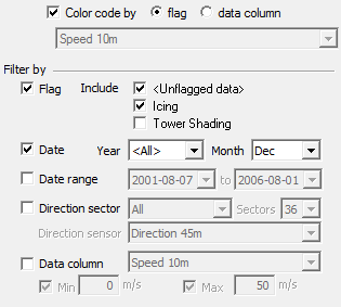
The graph above was created using the following filter settings:
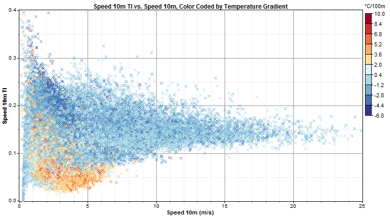
All scatter plots provide information about two data columns, the one one the x-axis and the one on the y-axis. But you can include information about a third using the Color code by data column option. Choose a data column from the drop-down box, and Windographer will color each data point in the scatter plot according to the values in that data column.
The example below plots turbulence intensity versus wind speed, color coded by temperature gradient. It shows that most of the instances of lowest turbulence occur during times of highly positive temperature gradient, meaning very stable conditions. It also shows that many of the instances of highest turbulence correspond to times of highly negative temperature gradient, meaning very unstable conditions:
The Filter by section allows you to create a scatter plot for a subset of your data. Windographer includes any time step in which X or Y meets the filter criteria. In the Color coding by flag example above, if a given 10m speed data point is flagged with icing and the 45m speed data point in the same time step is flagged as tower shading, the point will be included in the scatterplot. For more information see the article on filtering data.
The Show line of best fit checkbox allows you to select whether you want the line of best fit to appear on the graph. Windographer calculates the line of best fit by performing a linear least squares regression. If checked, Windographer displays below the checkbox the equation of the line of best fit, along with the r2 value which indicates the goodness of fit. The r2 value is a number between 0 and 1. The closer it is to 1, the better the fit. When the line of best fit is shown, Windographer also allows you to force a zero intercept for the line, in cases where you know it should pass through the origin.
You can create polar scatter plots on the Wind Rose window.
The help article Using a Scatter Plot as a Quality Control Tool provides an example of using this window for quality control.
Right-click any graph to change its properties, copy the image to the clipboard, or export it to a file. For information about exporting graphs from Windographer, please refer to the article on exporting graphs.
See also
Using a Scatter Plot as a Quality Control Tool