
| Histogram Window | |
The Histogram window displays, in graphical or tabular format, the frequency distribution of a data column, which shows the frequency with which the data column's values fall within different bins.
You can also choose whether to display the frequency of occurrence or the number of occurrences. For any bin, the frequency of occurrence is equal to the number of occurrences in that bin divided by the total number of occurrences.
Windographer automatically chooses a reasonable bin size, but the bin settings controls allow you to override the default.
The example below shows that the 'Spd 30m' data column falls within the range of 0 to 1 m/s about 1% of the time, 1 to 2 m/s about 2% of the time, 2 to 3 m/s about 4% of the time, and so on:
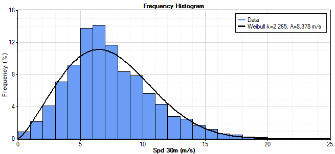
Tip: When you create a frequency histogram of a wind speed data column, Windographer will also plot the best-fit Weibull distribution (calculated using your preferred Weibull fit algorithm) so you can see how well it fits the actual distribution of wind speeds. For a more detailed Weibull analysis, see the Wind Speed Distribution window.
Use the Format buttons to switch between graphical or tabular format. The table shows both the number of occurrences and the frequency of occurrences for each bin:

You can also to choose to display a histogram of all the primary columns of any type:
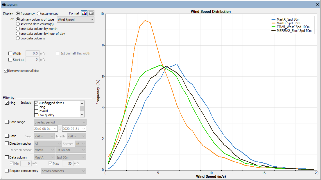
You can also view the distribution of a data column by month or by hour of day. In tabular format, Windographer will show a table with one column for each month or hour of day. In graphical format, it will show a graph with one line per month or hour of day. The graph below, for example, showing the distribution of a wind speed data column by month, indicates that the wind speed seldom exceeds 10 m/s in July, August, and September.

If you choose to display the frequency or number of occurrences versus two data columns, controls appear that let you select the primary and secondary data columns. In graphs, these correspond to the x and y-axes, respectively. In tables, they correspond to rows and columns, respectively. In the example below, the darker areas show a range of speeds and temperatures that occur more frequently. The white squares indicate zero frequency.
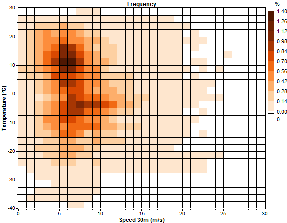
You can change the color scheme by right clicking such a graph. Note that for a time step to count as an occurrence, both data columns columns must report data that satistfies your filter criteria.
If you check the Remove seasonal bias checkbox, Windographer will generate twelve histograms, one for each month of the year, and then calculate a seasonally balanced histogram in which each bin contains the mean of monthly means of that bin's values in the twelve monthly histograms.
The Filter by section allows you to filter for a subset of your data. For more information see the article on filtering data.
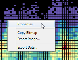
Right-click any graph to change its properties, copy the image to the clipboard, or export it to a file. Right-click on any table to export its contents to a text file or to copy it to the clipboard. For more information, please refer to the articles on exporting graphs and exporting tables.
See also
Preferred Weibull fit algorithm
Wind Speed Distribution window