
| Wind Rose Window | |
The Wind Rose window allows you to create many types of polar plots and their tabular equivalents. This tab will operate only if you have identified one or more wind direction data columns in the Configure Dataset window.
On the left side of the tab appear several controls that allow you to specify the type and properties of the graph or table that you want to create. Some formats can incorporate all wind direction sensors, some only one, and some can include other data columns as well.
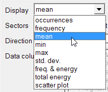
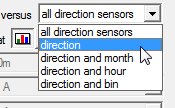
Use the first drop-down box to choose the type of data you wish to display. Depending on your choice, the second drop-down box allows you to subdivide by month or time of day, or to bin by another data column.
The Sectors drop-down box lets you control the number of sectors into which Windographer divides the circle. (You can set the default number of sectors in > .) The Format buttons let you choose between graphical or tabular form, and the Filter by controls let you filter for a particular subset of your data. For more information see the article on filtering data.
The Wind Rose window displays several types of graphs and tables showing occurrences or frequency by direction.
If you choose to plot frequency versus all direction sensors, Windographer will create a wind rose showing, for each wind direction sensor in the dataset, the frequency with which the wind direction falls within each direction sector. When calculating occurrences or frequency by direction, Windographer counts only those time steps that contain a valid wind speed that meets or exceeds the calm threshold. The relevant wind speed sensor is the one that you have associated with the wind direction sensor in the Configure Dataset window. The percentage of time that the wind speed is at or below the calm threshold does not appear on wind rose graphs, but you can see this value in the tabular representation of the same data.
The example below shows that the wind blows most often from the south:
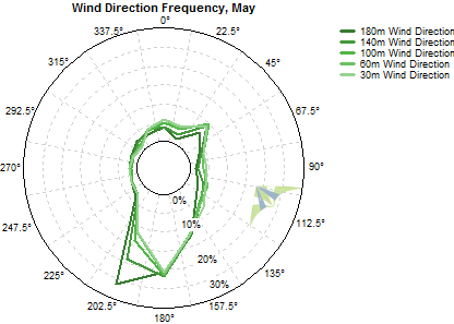
Radius indicates frequency in this kind of graph. This example shows that each sensor reports a southerly wind about 20% of the time, and a northwesterly only about about 2% of the time. You can see the precise values by switching to tabular format.
The occurrences versus direction plot shows similar information, but also reveals differences in the number of valid data points. The example below, which corresponds to the frequency graph we just saw, shows that the 180m Wind Direction sensor reports only 250 occurrences of South wind, while the 30m Wind Direction data has over 850. That reflects a much lower data recovery rate at 180m than at 30m.

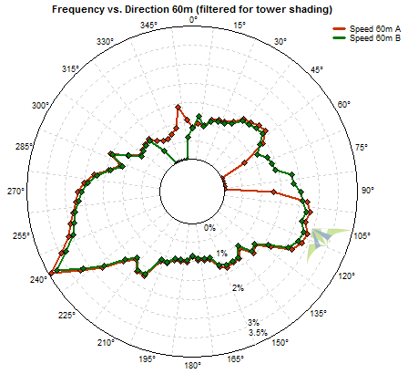
If you choose to display occurrences or frequency versus direction, you can select any subset of data columns to analyze. This can help highlight differences from one data column to another, as in the example below that shows the effects of filtering two 60m wind speed sensors for tower shading:
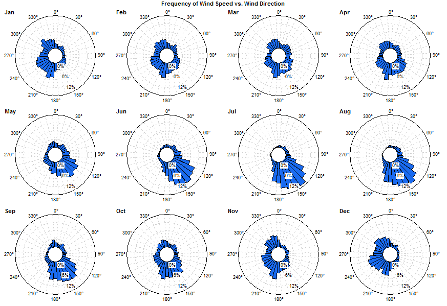
If you choose to display occurrences or frequency versus direction and month, Windographer does a separate analysis for each month of the year, and shows the results either as twelve separate graphs, or as a single graph with a line for each month. The example below shows that easterly winds predominate in winter months, but southwest winds predominate in the summer months:
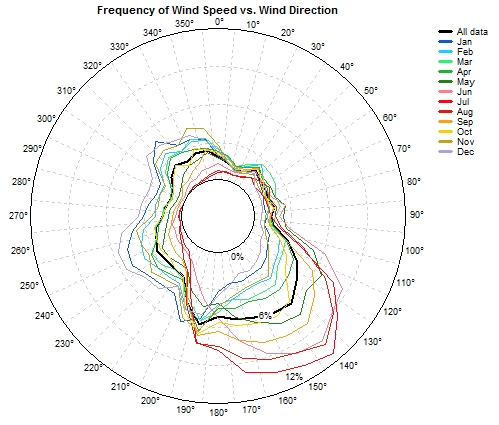
The same data shown in a single graph appears like so:
You can also choose to subdivide by time of day, in which case Windographer divides the 24 hours of the day into twelve two-hour slices.
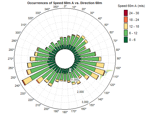
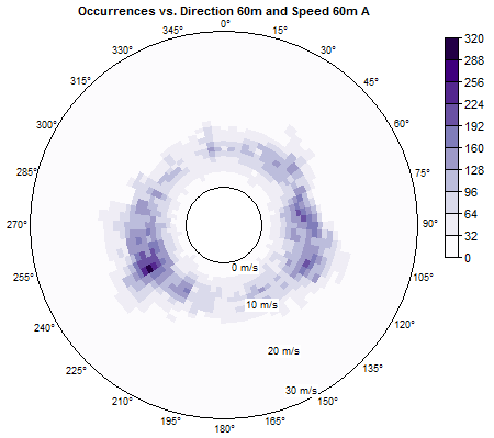
When you plot occurrences or frequency versus direction and bin, you can choose between two drawing styles, the first representing frequency by radius and bin by color, and the second representing bin by radius and frequency by color. The first style shows stacked bars for each direction sector, with one bar for each bin, where bar length indicates frequency or number of occurrences. The example below shows occurrences versus direction and wind speed bin:
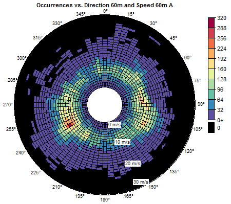
The second of the two drawing styles divides the radial axis into bins, and uses color to indicate frequency or the number of occurrences. The example below shows occurrences versus direction and wind speed bin:
Double click on any such 'intensity plot' to choose a different color scheme or set other properties. Some color schemes assign a separate color to zero, and some do not. The graph below shows exactly the same data as the one above, but uses a color scheme that does not highlight zero.
You can also plot the statistics of any data column versus direction, versus direction and month, or versus direction and a second data column.
When you plot a statistic versus direction, Windographer will create a wind rose with one line for each data column that you choose. The example below shows the mean of each wind speed sensor versus wind direction:

You can choose to plot as many data columns as you wish in that kind of graph, provided they all share the same units. Note that Windographer calculates the statistics from the data column that you choose, and not from any associated data column. For example, if you plot the maximum value of the 'Speed 30m' data column by direction, the graph or table will show the maximum value of that data column in each direction sector. If you had used the associated column drop-down boxes in the Configure Dataset window to identify another column called 'Speed 30m Max' as containing maximum speeds in each time step, that would have no effect on this graph.
Plotting a statistic versus direction and month causes Windographer to create either twelve graphs, or one graph with a line for each month. The example below shows the mean wind speed by direction and month. It shows considerable similarity across the months for westerly winds, but a large difference between summer and winter months for easterly and especially northeasterly winds.
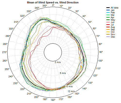
You can also choose to display versus time of day, which causes Windographer to subdivide the data into twelve two-hour time slices, one for midnight to 2am, one for 2am to 4am, and so on. The example below shows a similar directional pattern for each time slice, but lower mean wind speeds during the daylight hours:

If you choose to plot a statistic versus direction and bin, Windographer will create an intensity plot where the color indicates the value of the statistic, and the radius indicates the value of the data column you have chosen to define the bins. In the example below, which shows the mean temperature versus direction and wind speed, the radial bins correspond to wind speed ranges. In this example, strong southeasterly winds are the warmest on average, and strong southwesterly winds are the coldest.
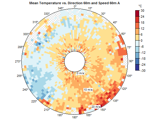
The hatched portions of that kind of graph indicate empty bins.
The frequency and energy rose displays, for a single speed sensor, the frequency with which the wind blows from each sector, as well as the proportion of the total wind energy coming from each sector:

Switch to tabular format to see additional information.
The type of wind rose Windographer creates when you choose Total energy is exclusively for plotting the proportion of wind energy coming from each direction sector. Windographer uses the wind power density (WPD) calculated for each wind speed sensor for each time step, sorts them by direction sector and calculates the total energy available for each direction over the entire period of the dataset, or the portion you have chosen in your filter settings. The graph or table displays the portion of the total wind energy coming from each direction sector.
The example below shows that about 22% of the total amount of energy in the wind comes from the northeast direction, with another 15% coming from the NNE direction and 6% coming from two south sectors.
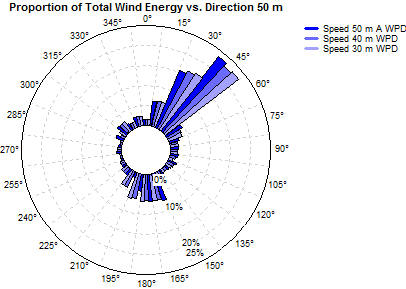
Switch to tabular format to see the exact amounts. Note that increasing the number of direction sectors in your graph or table will likely reduce the contribution by each sector.
You can display the total energy and frequency on the same plot by choosing freq & energy. This will allow you to compare percent of total time and the percent of total energy in each sector.
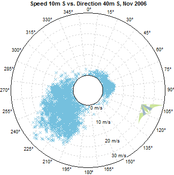
If you choose to display a scatter plot, Windographer will create a polar plot with a small X mark for every data point. The value of the direction sensor determines the azimuth, and the value of your chosen data column determines the radius of each point. The example below plots the wind speed at 10m versus the wind direction at 10m for November 2006. In this example the strongest winds all blow from the southwest.
Scatter plots have no tabular equivalent.
Right-click any wind rose to copy the image to the clipboard or export it to a file. For more information please see the article on exporting graphs.
Right-click any wind rose to change its properties.
See also