
| Graph Properties |  |
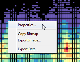
Double click any graph in Windographer to edit its properties, or right click and choose from the pop-up menu:
The Properties window lets you edit the graph's title, axis labels, axis ranges, line styles, colors, and legend. Note that you can also change the data column colors from the Configure Dataset window.

Windographer will include a title and axes labels for each graph. To return to the default text, simply clear all text from the input box. Note: If you edit the text, it will remain in place, even if you change the data to be plotted. When you close and reopen the window, the labels will be reset to the automated Windographer text.

Windographer automatically sets the axis limits to reasonable values based on the range of data displayed, but you can set them directly in the Graph Properties window. Select the check box to edit and specify the axis minimum. In the image below, the X axis is auto scaled, but the user has fixed the Y axis range at -10 to +35. Note: If you specify the axis range, it will remain in place, even if you change the data to be plotted. When you close and reopen the window, the axes return to auto scale.

For polar plots, additional axes settings are available as explained below.
Addding a legend to a Windographer graph can help to clarify the plotted data, particularly for graphs with multiple lines.
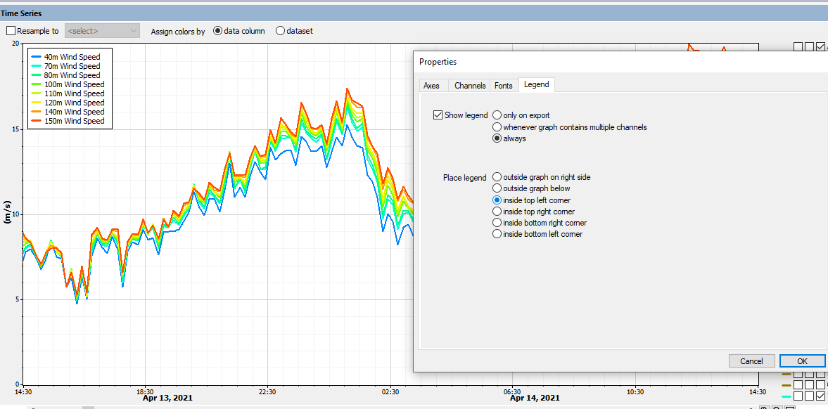
Tip: When you right click on a graph and choose to export the image, you will have a chance to include or exclude the legend without affecting the graph that appears within Windographer.
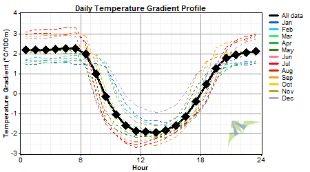
From the tab, you can control the line styles. For any line graph, you may want to adjust the drawing style to change the look of the graph, to display the data more clearly, or to distinguish one line from the others, as in the following example:
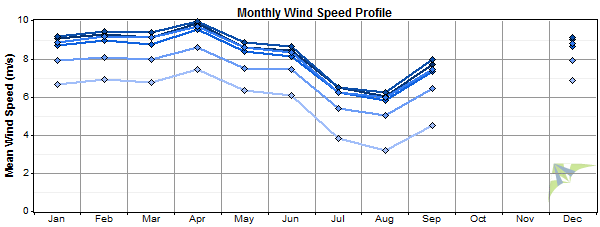
Adding markers to a line graph can help clarify the location of measured points, or even reveal the location of data points that may not appear in lines-only graphs -- data points surrounded by gaps, for example, such as the December points in the following example:
The 'stair-step' style is available for time series graphs only. It makes explicit Windographer's assumption that the value remains constant over the time step. The following example shows hourly average wind speed data:

Filled graphs or 'area graphs' are sometimes useful, for example to emphasize a critical threshold value like zero degrees in a temperature graph:

For any polar plot, you can control the axis properties, including the max, min and inner radius space. Increasing the inner radius size tends to decrease the 'area distortion' effect inherent to polar graphs, which occurs most strongly at the center of the circle. But it also leaves more of the available area unused, so you will may want to experiment to find the value that you find optimal. The following sequence of graphs shows the effect of increasing the inner radius size:
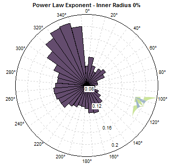
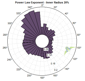
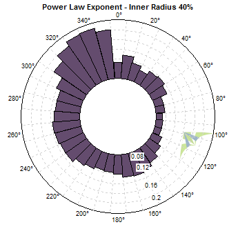
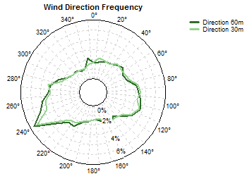
As with Cartesian graphs, you can choose among several drawing styles for polar graphs. The simple line style allows several variables to appear on one graph:
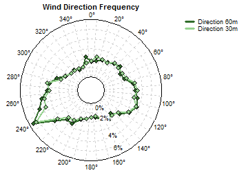
Adding markers can improve visibility in some cases:
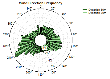
Pie slices work well for one or two variables:
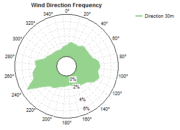
And the 'area' style can work well for a single variable:
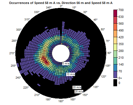
Intensity plots show the value of a variable versus direction and bin, such as this example:
Occurrences or frequency by bin and direction can also be plotted as stacked bars for each direction sector, as in this example:
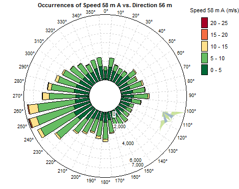
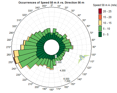
You may prefer to adjust the 'fill factor' for such graphs. The example above uses a fill factor of 70%, meaning the bars use 70% of the available width. If you set the fill factor to 100%, the bars touch each other as in this example:
To adjust font sizes in any graph, you can choose from a range of preset font sizes, or enter the precise font size you wish to use for titles, axis labels and legend text.
Tip: When you right click on a graph and choose to export the image, you will have a chance to adjust the properties of the exported graph, without affecting the graph that appears within Windographer.
See also