
| Time Series Window | |
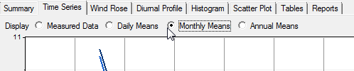
The Time Series window displays one, two or three time series graphs with which you can plot any of the data columns (including calculated data columns) in the dataset. Using the buttons at the top of the page you can choose to display the measured data themselves, or the daily, monthly, or annual averages of those data. Using the scroll bar and zoom buttons at the bottom of the page you can plot any portion of the dataset.
When calculating the daily, monthly, and annual averages, Windographer uses default flag filtering, and it refers to the minimum data coverage requirements that you enter in > . Mean wind direction values are vector averages.
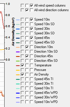
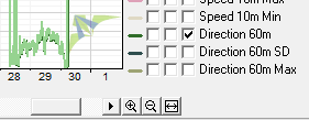
Use the checkboxes on the right side of the window to choose which data columns you want to display. The first column of checkboxes control the upper graph. You can plot data columns with one type of units on the left y-axis, and a second type of units on the right y-axis. The data column that you select first will be displayed on the left. In the example below, the user has chosen to display temperature and air density in the upper graph, all wind direction columns in the second graph, and three wind speed columns in the lower graph. Since the upper graph is already displaying two different types of units, Windographer has disabled the checkboxes that correspond to data columns with different units. To plot the Pressure on the top graph, the user could simply uncheck the temperature box and then select the Pressure data column.
Use the All wind speed columns checkbox to add or remove all speed columns with a single click. Use the All wind direction columns checkbox do the same for all direction columns.
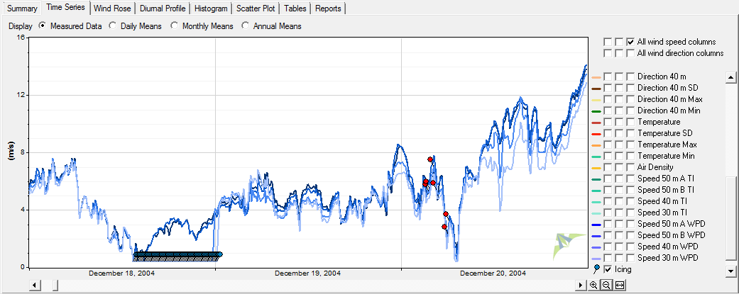
Flagged segments appear in the time series graph as colored bubbles. At the bottom of the legend appears one checkbox for each flag used in this dataset. Select the flags that you would like to see. In the example below, the user has chosen to display both the icing and tower shading flag bubbles. Flagged data points will appear in the graph whether you choose to display flag bubbles or not.
Flags whose properties indicate that they should not appear in time series graphs do not appear in the list of flag checkboxes, and data segments flagged with such flags do not appear in the graphs. If a data logger reports missing values as 9999 for example, you could apply the 'Invalid' flag to those values and specify in the Define Flags window not to display that flag in time series graphs. Then missing sections of data would appear as blanks in the time series graphs, and would not distort the y-axis scale.
You can flag data using a time series graph from the Flag Manually window.
Use the scroll bar below the graph to move the graph forward or backward in time, and click the zoom buttons to the right of the scroll bar to zoom in or out. The third zoom button zooms out to display all the data.
Or use the following shortcut keys on any time series graph:
| Shortcut | Action |
|---|---|
| +/- keys | Zoom in/out |
| mouse wheel | Zoom in/out |
| Up/Down arrow keys | Zoom in/out |
| Right arrow key | Scroll right (forward in time) |
| Left arrow key | Scroll left (back in time) |
Click and drag on the graph to select an interval on which to zoom:

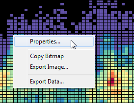
Right-click the graph to change its properties, copy the image to the clipboard, or export it to a file. For more information please refer to the article on exporting graphs.
See also