
| Tower Distortion Window | |
This window explores the impact of the distortion that the meteorological tower causes in the airflow. It does so by calculating the ratio or difference of the wind speeds reported by each pair of colocated anemometers, and then displaying that information versus wind direction. You can access this window by choosing from the menu.
Tip: This window can only analyze datasets that contain at least two wind speed sensors and one wind direction sensor.
Disagreement between sensors often results from tower distortion effects (e.g. the tower shades one sensor and not the other when the wind blows in a certain direction), but can also occur due to other factors including sensor degradation, sensor malfunction, uneven icing, and calibration errors.
In you can specify the maximum difference in height above ground that two speed sensors can have and still be considered colocated. By default, this window makes use of that value that you specify in the Options window, but you can change that parameter in this window if you wish.
You can also choose whether to compare the wind speed sensor pairs in terms of ratios or differences. In some cases plotting ratios will lead to the clearest display of tower distortion patterns, while differences may be best in other cases, so it is worth experimenting with both options.
The drop-down boxes allow you to choose the pair of wind speed sensors and the wind direction sensor that Windographer uses for the analysis.
If you choose to display all sensor pairs, Windographer will show a graph of the median value versus direction. Use the Shape buttons to choose polar or Cartesian format. When displaying all sensor pairs, Windographer automatically chooses the nearest-in-height direction sensor for each pair, so for example it will use the 30m direction sensor for the 30m anemometers, and the 50m direction sensor for the 50m pair.
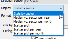
When you choose to plot a specific pair of wind speed sensors, additional options become available to customize your view of the data. The Direction sensor drop-down box lets you choose the direction sensor with which to define the direction sectors. The Display drop-down box let you choose among several options:
This option displays a statistical summary for each of 72 direction sectors, which you can view in tabular or graphical format: either polar or Cartesian. Note that the graphical and tabular formats present slightly different information. The 25th and 75th percentiles appear only on the graph, whereas the number of time steps and the mean, minimum, maximum, and standard deviation of the values within each sector appear only in the table.
If you have specified boom orientations in the Calibration window, the graphs will indicate where each sensor should be shaded (which is 180° from the boom orientation) as in the example below.
TowerDistortionAnalysisExample.windog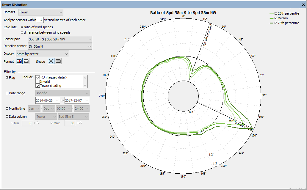
In this mode you see the median ratio or difference versus direction sector, with every calendar year of the dataset shown as its own line or in a separate graph, depending on the Style button that you select. This kind of subdivision can help detect shifts in boom orientation over time.
This mode displays the ratio or difference versus sector, subdivided by calendar month. With longer datasets that cover many months, you may choose to filter for a particular year as in the example below:
TowerDistortionAnalysisExample.windog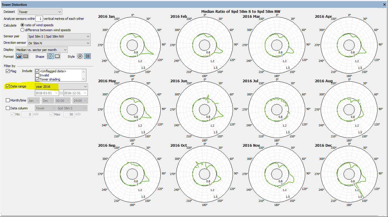
The scatter plot shows the ratio or difference versus direction for every time step, a display mode that sometimes reveals additional information about the relationship between the two speed sensors. As always, you can filter by flag, time, or another variable to help focus on a subset of the data.
This display option displays a scatter plot of ratio or difference for every year covered by the dataset (or the subset you specify in the filter settings) superimposed by the median vs. sector line for each year.
This display option displays a scatter plot of ratio or difference for every month covered by the dataset (or the subset you specify in the filter settings) superimposed by the median vs. sector line for each month, as in the example below:
Chattanooga.windog
The table in the lower left corner presents statistics for all the sensor pairs in the dataset. These statistics will automatically reflect any filters that you apply. Windographer calculates these statistics from the ratios even if you choose to display differences in the graphs and tables.
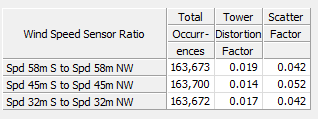
The tower distortion factor is a measure of average tower distortion, based on the median ratios in each direction sector. A tower distortion factor of zero means that the sensors always report the same wind speed in each sector. The larger the value, the greater the difference between the wind speeds the two sensors report.
The scatter factor is a measure of spread in the ratio of the readings of pair of wind speed sensors. Windographer calculates this factor as a weighted mean of the standard deviation of the ratios in each direction sector. The mean is weighted by the number of data points in each sector.
The Filter by section allows you to restrict the analysis to only a subset of your data. For more information see the article on filtering data.
This window contains a variety of different options to control the display of the comparison between the measurements of two colocated anemometers. How you use it will depend on the types of effects for which you are looking. Here we present some examples of common uses for this window.
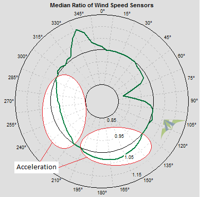
Using this window you can visually identify the tower distortion pattern in the data. The tower distortion pattern, in addition to showing tower shading, also reveals when flow acceleration around the tower causes an increase in wind speeds reported by an anemometer, as highlighted in the example below. You might use this information to scale or correct the data.
The scatter plot can help distinguish changes in the shading patterns over time, such as may occur as a result of a sensor being moved partway through the recording period, or experiencing degradation in its performance. You could try filtering for different date ranges to verify such an occurrence.
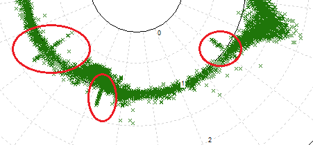
The polar scatter plot ratio graphs can often help locate icing events in which the wind vane freezes in position while the anemometer continues to report fluctuating wind speeds. Such events appear as straight radial lines of points in the polar scatter plot:
See also