
| Algorithm Performance Test Window | |
The Algorithm Performance Test window allows to conduct a cross-validation experiment to compare the performance of each algorithm. This is an optional step in the MCP process, but it can be a very useful one because it can help reveal which algorithm and what settings lead to the best results in each situation. Windographer begins the experiment by dividing the concurrent data into a training period and a testing period, and then for each algorithm it:
You can decide how many test iterations to perform, and whether to choose a wind turbine power curve to convert wind speed values into wind turbine power output values. Windographer calculates the error statistics both in terms of wind speed and in terms of power output, and you can choose to display one or the other. The bar graphs show the mean bias error, mean absolute error, and distribution error for each algorithm.
You can choose whether you wish to view the results in terms of wind speed or power, and in absolute terms (m/s or kW) or relative terms (%). Windographer calculates the power values by passing the wind speed values through the turbine power curve that you chose on the Correlate Speeds tab (without any air density correction), and it calculates relative error by dividing the absolute error by the true mean.
You can choose from the following display options, some of which appear only if you chose to perform multiple test iterations, and some only if you chose to perform just a single test iteration.
This option provides an at-a-glance summary of the results in a single window. This summary includes:
This table displays the following information for each test iteration:
Choose this option to see a graph showing how the mean and standard deviation of MBE, MAE, or DE evolved over the course of the test process. As the mean and standard deviation incorporate more and more test iterations, they tend to converge, or settle down to a stable value. These graphs can help reveal whether you have completed enough iterations for the results to have converged, or whether they are still showing considerable variaion from one iteration to the next. The graphs below, for example, show that the mean of the mean absolute error in wind speed converged after 25 or 30 test iterations, but the standard deviation of the MAE values continues to vary a little even after 50 test iterations:
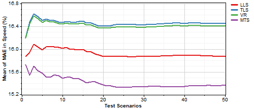
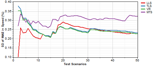
From those graphs, you might conclude that you have completed enough test iterations to ensure accurate results, or you might decide to increase the number of test iterations.
These 'evolution' display options appear only if you have run a test comprising multiple iterations.
This option displays a data coverage diagram of the training and testing periods for each test iteration. The example below shows three test iterations, in each of which Windographer has randomly divided the available data evenly into training and testing subsets:
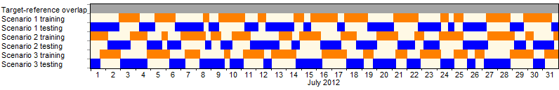
Note that for long concurrent data periods or one year or more, the limited resolution of the diagram may make the segments merge together into a solid bar of color.
These options allow you to plot the various error metrics versus month, hour of day, or direction. The MAE graphs also appear under the summary option.
This option shows a histogram of the wind speeds predicted in the testing period by each algorithm, compared against the histogram of true target wind speeds in the testing period. In the example below, the LLS algorithm has produced a distribution that is narrower than the true distribution, while the MTS algorithm has produced a distibution that matches the true distrbution more closely.
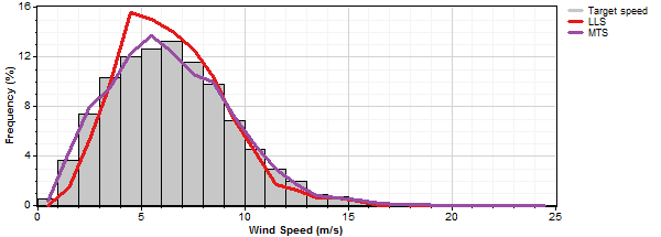
The histogram of predictions option is available only if you have performed a test with a single iteration.
This graph shows a probability distribution of bias error values for each algorithm. This gives a more detailed view than just a single mean bias error value for each algorithm. Not only can you roughly estimate the mean bias error value by eye, you can also see differences in variance, asymmetry, etc.
The histogram of errors option is available only if you have performed a test with a single iteration.
This option, which appears only if you have performed a test with a single iteration, shows a time series graph of:
This is the most fine-grained analysis option, as it shows the time series of bias errors, from which Windographer calculates all error statistics.
See also