
HOMER Pro 3.16

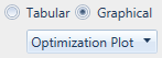
By default, the system Results are presented in tables in Tabular mode. You can also view the Results as plots. When the analysis involves more than one sensitivity variable, a plot often conveys the results in a more meaningful way than a table. Click the Graphical radio button at the top right to view plots of the results.
Right-click a graph to view or change its properties or export it as an image file.
The graphical Results page contains several plot types that allow you to visualize the results in various ways. Select the plot type you want to see from the drop-down menu that appears beneath the Tabular and Graphical radio buttons. The default is the OptimalSystemTypePlot. There are two types of plots, Sensitivity Plots and Optimization Plots.
•The first four options; the Optimal System Type Plot, Surface Plot, Line Plot, and Spider Plot; show sensitivity results. See the respective section of the help for more information on the first four options.
•The last two plots, the Optimization Plot and the Optimization Surface Plot, show the optimization for a sensitivity case you select. See the respective sections of the help for descriptions of these plots.
See also
